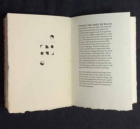
An experiment to see how changing nothing but the paper affects the appearance of text/type. In Updike’s essay “The Seven Champions of Typography,” the fifth champion he records is paper, and its (too often under-appreciated) influence on how any typeface looks when printed.
The extract from Updike’s essay was set in 12-pt Caslon (the face he mentions by way of example in the essay) on one page. Fifteen different papers were assembled, each presented as a folio (i.e. four-page section) with its name printed on the first recto, a design or pattern created from ornaments on the first verso, and the essay on the second recto. Thus, flipping through the book, ever other right-hand page presents the essay, in exactly the same setting, printed in exactly the same manner (damp, handpress), with only the paper changing.
The papers include are: ten different Barcham Greens plus Wookey Hole, Warren H. Colson, Amalfi, Velke Losiny, and kaichu shi. Ten deluxe copies included an additional seven papers that were available in more limited supply, including scraps from a 1665 Blaeu atlas (text pages from a broken copy).
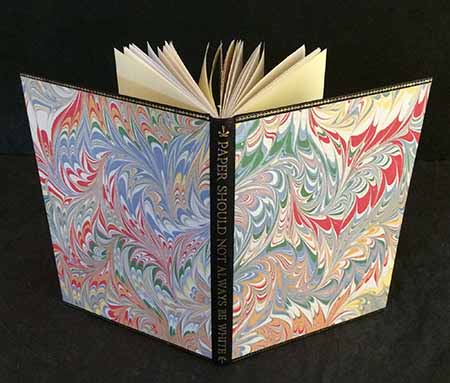
Paper Should Not Always Be White (5 x 7 inches, [54 pp.]) was issued in an edition of 30 copies, all bound by Claudia Cohen. Copies 1–10, with the additional samples, were bound in full leather with onlays. Copies 11–30 were bound in quarter leather with marbled paper sides.